Postcard from Jaffa 14 July 2014 No Comments
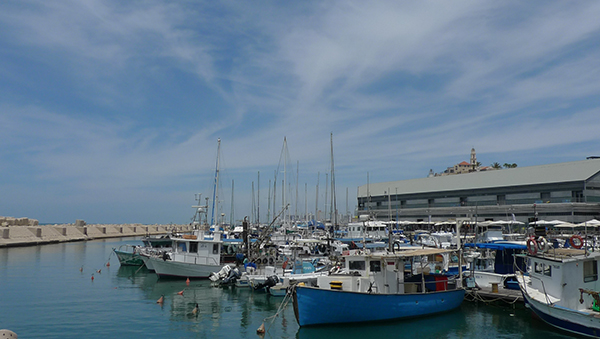 The port of Jaffa is a very ancient place, and though it looks somewhat sleepy today, it was a bustling, working harbor for many centuries before the Egyptian Pharaohs took note. Located on a high tel on the eastern coastline of the Mediterranean, Jaffa’s strategic position (evident in maps both old and new) guaranteed its geo-political-economic importance into the modern era.
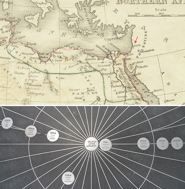
Despite the treacherous waters around the Andromeda rocks, merchants, pilgrims, and colonists all passed through Jaffa, coming from somewhere else and going to somewhere else. The Cedars of Lebanon en route to Solomon’s Temple, the Empress Helena en route to the via Dolorosa; the Shamouti [a.k.a. Jaffa] Oranges en route to the world. And then there were the soldiers, legions of them across the centuries, commanded by military legends like Thutmose, David, Alexander, Richard the Lionheart, Saladin, Napoleon, and Allenby, each of whom regarded Jaffa as key to victory.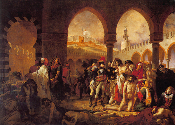
When Napoleon turned up in Jaffa in March of 1799, the French army d’ Orient had already laid siege to the redoubt as part of its Syrian Campaign, ransacking the port city and slaughtering approximately 3,000 Ottoman prisoners of war. Bonaparte entered Jaffa on March 11th on a mission of damage control, seeking to minimize the significance of an outbreak of bubonic plague and to quell rumors that he had ordered a military doctor to poison the victims, including members of his own army. Boldly, he enters the military hospital temporarily installed in the Armenian Convent on the Jaffa waterfront; dramatically, he reaches out towards an afflicted French soldier. Fearing neither disease nor grandstanding, the General touches the swollen lymph nodes of the soldier’s armpit. At least that’s how Antoine Jean Gros depicted the event five years later, in a canvas commissioned by the newly declared Emperor Napoleon with propagandistic intent. Le tricolore flying on the hill in the background didn’t waive over Jaffa for long. By June of 1799, Napoleon had ordered a full-on retreat, south through the desert and back into Egypt.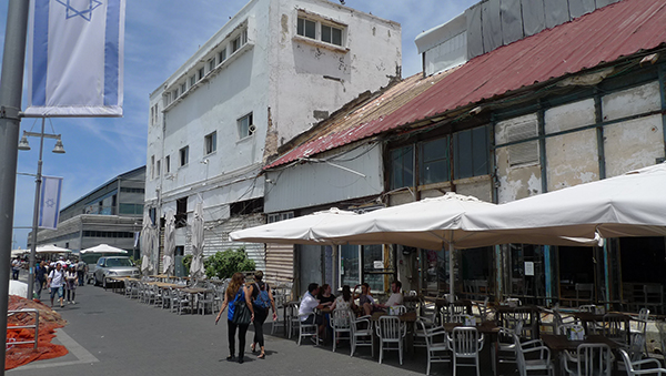
Walking the waterfront today, past the trendy cafes and fashionable boutiques that are hallmarks of urban revitalization across the planet, it takes a sharp eye to locate the remains of the Pestilence House of Jaffa–and not just because most of the buildings lack the exaggerated Orientalist details that Gros so hotly imagined (I wish I had laid eyes on a courtyard with such a crazy, ziggurat-like, corbeled parapet).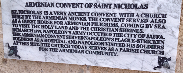
Even the most studious tourist, upon locating a sign identifying the Armenian Convent, might be forgiven for confusing the Pestilence House at Jaffa with a luxury condo, mainly because the Pestilence House at Jaffa is a luxury condo.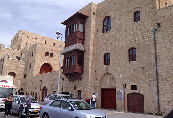
Though the small Church of St. Nicholas is still intact and open for services, much of the complex, including parts of the monastery and the pilgrims’ hospice, has been transformed into a series of private residences by “a bespoke property development company” based in London. The sandstone walls, the arches and openings, the woodwork, it’s all been stabilized and restored with the exterior imperfections so perfectly preserved that it could only be the product of 21st century historical self-consciousness.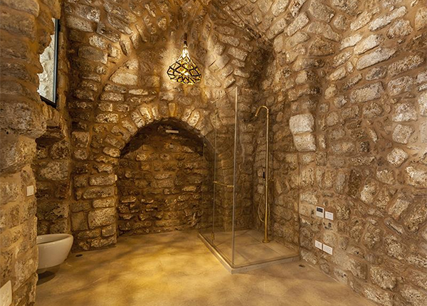
This is hardly the exclusive purview of the folks responsible for the work at the Armenian Convent. A few doors down, Sotheby’s International Realty is offering a 5 bedroom apartment for $13.7 million, one that inserts the “ultramodern” into a “[framework] of ancient archeological architecture.” Which likely explains that bidet tucked inside a 12th century vault.
Back at the Armenian Convent, while keenly exploiting the monastery’s “steeped in history” Napoleon-was-here marketing potential, the company website tactfully avoids any mention of swelling buboes and dying soldiers. Nothing takes the sheen off of high end real estate like an infectious disease, except maybe the fraught legacy of displacement, abandonment, and settlement that has characterized Jaffa since 1948. Needless-to-say, these are not mentioned either. But that’s not really surprising.
In the 21st century, it may well be that the only force strong enough to overcome political and religious factionalism is the one that replaces it with gaping class divisions and staggering income inequality: restless and relentless global capitalism.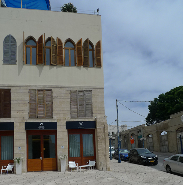
And unlike Napoleon, the W in Jaffa (opening summer 2015) shows no sign of retreat.
Up In the Air 26 January 2014 No Comments
2014 marks a decade since since Google acquired Keyhole Corporation, a Silicon Valley start-up whose mapping technology transformed the way we see the world. Keyhole created the seamless combination of high-resolution satellite and aerial imagery that provides the geo-located guts of Google Earth and Google Maps, the satellite view that has become a ubiquitous part of our digital lives.
As a descriptor, satellite is sexier than aerial, conjuring Sputnik and the space age instead of the drifting balloons and lumbering dirigibles in which photography first took flight. Somehow, the view from space has managed to retain its romance. But then I was one of those kids in the 70s who wrote to NASA for views of space–photographs of Mars sent back by the Viking orbiter. 
They arrived in a big manilla envelope stiff with cardboard and emblazoned with NASA’s brand new logo. Richard Danne and Bruce Blackburn designed the so-called worm to replace the Administration’s original meatball logo (to which it returned in 1992). With its sleek continuous letterforms and missing cross strokes, the NASA worm looked absolutely like the future to me–and so did the pictures inside the envelope.
Today, we spend more time engaged in the planetary equivalent of navel-gazing. It’s not the red planet that captures our imagination; it’s our own “big blue marble,” a preoccupation that also dates to the 70s, when Apollo 17 astronauts sent back the now iconic view of the illuminated face of the earth. If photo #AS17-148-22727 gave us a sense of the earth’s wholeness (as in Whole Earth, which used a comparable 1967 view on the cover of its first catalog), it was Charles and Ray Eames who provided a sequential point of view.
In 1968, the Commission on College Physics (which promoted physics education during the space race) asked the Eameses to make a film to explain exponents. Their famous response used Kees Boeke’s Cosmic View: The Universe in 40 Jumps as the starting point for a dramatic human-scaled visualization of moving through space by Powers of Ten. In the revised and expanded version of 1977 (which my elementary school screened in an assembly), it takes just over a minute to move out from a couple picnicking on a lawn near Lake Michigan to the whole earth view of 10,000,000 meters (10 to the 7th power).
What was mind-blowing then, we take for granted now. Even though the jumps are not as regular as in Powers of Ten (in Google imagery they shift back and forth between meters and feet, kilometers and miles), with a few mouse clicks, we easily apprehend how different Chicago’s Burnham Park looks today.
In 1977, the couple picnicked on a flat expanse of lawn hard by the northbound lanes of Lake Shore Drive and the parking lots of Soldier Field. In 2014, they would spread their blanket in a picturesque landscape of grassy berms, walking paths, trees and a winding roadway–the results of a 1996 road relocation and a 2003 renovation of the stadium (the one that resulted in its de-listing from the National Register). Attempting to show us “the relative size of things in the universe” and “the effect of adding another zero,” the Eameses anticipated a crucial aspect of contemporary visuality.
We zoom in, we zoom out; we locate ourselves with geospatial precision. We encounter bytes of biography: the Street View of my block of the Upper West Side captures one of those rare days when my very own car was parked outside of my very own building. We spot details that produce a frisson of familiarity: the outline of the Central Park reservoir, the shadow of an oversized winged “radiator cap” on the 31st floor of the Chrysler building.
Mostly, though, we click and drag with detachment; blame it on digital mediation or, less virtually, on the routine nature of the aerial view in a world of $99 round trips. But even in the 21st century, in between the flat screen at hand and the pressurized cabin at 30,000 feet, we can still find moments of visceral visual experience, of emotional resonance and maybe even joy–as I discovered when I climbed aboard an Airbus Eurocopter AStar 350 for a 30 minute ride.
My companions had hoped for a Sikorsky (departing from the Westchester County Airport, we were very nearly in the Black Hawk‘s home territory of southern Connecticut), but I had no preference, my ignorance of helicopters trumping my customary localism. As it applies to metropolitan development and centralized urbanization, localism wasn’t so much trumped that morning, as radically intensified.
Flying from White Plains to Midtown, we knew what to expect: low rise giving way to high-rise, greenfield to asphalt, open space to density, suburb to city. Even if we didn’t reside in Greater New York, even if we’d never been to the Panorama in Flushing Meadow, this particular urban morphology belongs to the collective memory of the 20th century. We knew it instinctively, even before the helicopter left the ground.
But there it was, the periphery giving way to the center with startling clarity and autumnal color (it was mid-November) at somewhere around 1500 feet. If the birds-eye perspective does little to improve the view of McMansion subdivisions, it gives even undistinguished corporate and college groundscrapers an aura of geometric abstraction.
Structures already possessing geometric abstraction–like the Breuers in the Bronx (originally NYU/now Bronx Community College)–appear even more potently sculptural. Even the Cross Bronx Expressway, when seen from above, looks less “hacked with a meat axe” (as Marshall Berman memorably described it), the graceful curves of its interchanges almost convincing us that it is not the ring of hell we know it to be from behind the wheel.
We followed the East River until we could see the towers clustering at the lower edge of Central Park, and then we turned toward the middle of the island. Looking south, you could see the skyscrapers giving way to mid-rise blocks of the 20s and 30s, where, according to tradition, the Manhattan schist is too far below the surface to support tall buildings (recent research has rendered this more urban legend than geological fact).
Between the thumping of the chopper blades, felt bodily, and the isolation of the headsets, experienced aurally, we hovered above midtown in a warp of dislocation. And yet we were absolutely in the city, maybe even of the city–if we accept verticality as urban essence. Flying in that helicopter was like a shot of hyper-reality (in a simple literal sense, rather than Baudrillard’s), the urban condition as adrenaline, imagined, actualized and exaggerated.
If the city I witnessed and photographed from the helicopter is nearly identical to the one captured in images accessible on Google 24/7, there’s one critical difference: looking at midtown on Google Maps or Google Earth has never made me weep.
Sheepish 1 November 2013 No Comments

In 1934 Robert Moses kicked the sheep out of Central Park to make room for Tavern on the Green. Though the New York Times applauded their contribution to park maintenance–the flock kept the meadow trimmed and fertilized for more than half a century–Moses claimed the 49 purebred Dorsets were deformed from inbreeding, so he sent them packing to Brooklyn, where they were kept in line by two Scotch collies who worked the pastures in Prospect Park.
They don’t look particularly deformed here, and it’s hard to imagine anyone who encountered them in 1930, when this photograph was taken, being concerned about genetic mutations while contemplating such a lovely contrast of pastoralism and urbanism. But then I’m partial to this sort of juxtaposition.

I live happily with Eva Sauer’s Rohbauten 03, which combines the high-key naturalism of William Holman Hunt and the Pre-Raphaelites (note the grazing sheep) with the sober objectivity of Bernd and Hilla Becher (note the concrete structure). Though the work has definite end-of-empire overtones, it seems to depict occupation more than abandonment.
That same effect, though with a large measure of surreal sweetness, lingers about Sheep Station, an installation by the late François-Xavier Lalanne in a former gas station in Chelsea. Lahanne built a four decade career on “les Moutons,” epoxy stone and bronze ovine sculptures that supposedly “demystify art and capture its joie de vivre.” It’s not clear how much demystifying is taking place on the corner of West 24th and 10th, but there is something quietly joyful, or maybe just goofy, about 25 cast sheep standing under the canopy of what was, until quite recently, a functioning filling station.
Corralled by white horse fencing and rows of junipers, the sheep stand about on artificial berms and a rolling lawn covered in real turf. They cozy up to the ice machine; they huddle around the pumps, as if waiting for their tanks to fill. Except there aren’t any cars, because the gas station is now a sheep station, get it? 
And the sheep station is an art station–Sheep Station at Getty Station, get it? So much self-satsified word play distracts us from larger narratives that are worth considering–about oil and art and art and real estate and real estate and oil. 
There’s nothing ironic about conjoining Getty and art since, after all, the world’s richest museum was established by an oil man. But the gas station that is now the Getty Station severed its ties to J. Paul’s original, eponymous company some years back.
Getty Oil organized a realty division in the early 70s to handle all property transactions related to its retail outlets and distribution terminals. This division remained part of the company that Texaco took over in the mid-80s, in one of the ugliest deals of a decade rife with notorious mergers and acquisitions. But during yet another takeover in 2000, when what remained of post-Texaco Getty was acquired by the Russian giant Lukoil, Getty Realty Corporation was spun off as an independent REIT responsible for around 1300 gas stations nationwide. Getty Realty promptly leased many of these stations back to Lukoil, which began rebranding them as part of its global chain.
On 24th and 10th, that meant an over-sized canopy with a distinctive K-profile and a red and white color scheme on the canopy, pumps, double-height free standing sign, and small CMU box housing a convenience store. This was hardly gas station retail design at its most heroic–nothing close to Walter Dorwin Teague’s work for Texaco in the 30s and 40s or Eliot Noyes’ and Chermayeff and Geismar’s work for Mobil in the 60s and 70s.
Instead, the Lukoil conversions offered only modest examples of what John Jakle and Keith Sculle call the place-product-packaging that was critical to the acceptance of the automotive service station as a ubiquitous feature of the American landscape in the 20th century. Lukoil’s lack of inspirational design is hardly surprising: in a New York Times article on the 2000 deal, an oil industry analyst observed that “these aren’t the nicest gas stations,” speculating that the company’s real motive was to burnish its reputation by acquiring (and then effacing) an American brand.
But Getty technically still owned these Lukoil gas stations, even though, with each passing year, it seemed to look at them more and more as real estate. With both oil prices and property prices at all time highs in the past decade, Getty began to evaluate its portfolio from a different perspective. When oil prices are high, it’s tough to make a profit selling gas (even with a convenience store attached); when property prices are high it’s easy to make a profit selling property, especially when those properties are in some of the hottest real estate markets in the country. 
In the first six months of 2013, Getty Realty Corporation sold 77 of its properties, including the gas station on 24th and 10th, which developer Michael Shvo purchased for $23.5 million with plans to turn the site into “the premier collection of luxury residences near the High Line.” When luxury condos became collections is the subject for another post; in the meantime, the newly rebranded Getty Station serves as an exhibition space. Cue the sheep.
It’s easy to grumble that yet another high-end condo will inevitably push the art out of Chelsea, exactly the way the high-end retail pushed the art out of SoHo, which is what caused the art to decamp to Chelsea in the first place–beginning with the Matthew Marks Gallery nearly 20 years ago. We all know how this works: the industry leaves, the artists move in, the dealers follow; the art lovers come to look at the art, the fashionistas arrive to attend the parties, the developers follow, jacking up the prices and causing the whole thing to start over somewhere else. We also know that in the 21st century how this works has gotten a whole lot more complicated. In Chelsea, for example, those complications include the redevelopment of the High Line into a tourist-jammed park, the rezoning of the neighborhood’s west side to encourage residential high-rises, and the coming-in-2015 institutional presence of the Whitney Museum, which is technically in the Meatpacking District, but feeds off, and contributes to, the area’s identity as contemporary art central.
Another complicating factor is that a certain sector of the industry never quite left, at least not until the art people and especially the real estate people forced it out. (Historical note: picking up my ancient Honda after having the interior steam-cleaned in the West 20s early in the century, I asked an innocent question, prompted by an urbanist’s curiosity about a rapidly transforming neighborhood: “Do you guys own your building?” The attendant’s eyes narrowed suspiciously, “You one of those art people?”) In between the warehouses and factory lofts west of 10th Avenue were garages, auto repair shops, and service stations in sufficient quantity to amount to a veritable gasoline alley by 1920 or so. By the time Berenice Abbott photographed the area in the mid-1930s as part of Changing New York, it was possible to see in them a certain kind of beauty.
Beautiful or not, gas stations and other auto-oriented businesses don’t fit tidily into most gentrification scenarios. They are slippery, liminal places: half industrial, half commercial, full of grease, grime, and low margins. And if they’ve been around long enough they are frequently contaminated brownfields in need of remediation. At the same time, whether we like it or not, they are absolutely essential to our car-bound way of life, even in as transit-oriented, bike-friendly, and walkable a place as New York City.
All those taxis have to get their gas somewhere, just not, anymore, at 24th and 10th. Recently, the Times took note of a phenomenon it called “Manhattan’s Vanishing Gas Stations,” though it’s happening in all the boroughs, and, in fact, across the country. Manhattan lost 44% of its stations in less than a decade; the city lost 35%; the nation as a whole lost 25% in two decades. So it turns out that Sheep Station at Getty Station is more appropriate than its developers realized. Their aim was “to incorporate a classic twentieth century American icon into the contemporary art dialogue,” but in Luxury City, the gas stations are quickly becoming museum pieces.
Chips and Chairs 13 September 2013 No Comments
Hanover, Pennsylvania sits six miles north of the Mason-Dixon line at nearly the same longitude as the District of Columbia. During the Civil War, this location, along with a critical east-west rail line, made it inevitable that the town would get caught up in the northern invasion Robert E. Lee launched in the summer of 1863. 
Hanover was raided by Confederate troops in late June, and the skirmish there on the 30th–between the cavalries of J.E.B. Stuart and the 18th Pennsylvania under Judson Kilpatrick–is frequently described as the prelude to the better-known and far bloodier engagement that began the next day, 14 miles west, at Gettysburg. This summer marked the sesquicentennial of the Civil War’s deadliest battle, so it was no surprise that the reenactors turned up in force in Hanover, too–along with 1,000 spectators, at least according to The Battle of Hanover Reenactment page on Facebook.
I got to Hanover too late for the faux fighting and had to content myself with contemplating The Picket, a statue originally installed in Hanover’s Center Square on the 50th anniversary of the battle. Standard war memorial stuff, the sculpture by Cyrus E. Dallin depicts an alert Union soldier on sentry duty astride a sleepy looking horse (in the attitude of horse and rider, it’s the exact opposite of the Sioux Chief and his mount in Dallin’s iconic Appeal to the Great Spirt, outside the MFA in Boston). Once dominating the intersection of Hanover’s major streets, The Picket was relegated to a widened sidewalk to improve traffic circulation at some point in the middle of the 20th century. If it’s lost some of its dignity with the addition of that dog statue, from a nearby cemetery, The Picket makes a nice counterpoint to the art deco detailing of the commercial block behind it. Not unlike The Picket, the tenant of that block–Clark’s Bostonian Shoe Outlet–is a reminder of something out of Hanover’s past, something once essential to its identity, but now merely vestigial.
At the turn of the last century, Hanover was a manufacturing center dominated by a local shoe company whose factory was just a few blocks north of Center Square and whose retail outlets marketed the town’s name across the United States. In a pattern all too typical of industrial communities (large and small), Hanover Shoes was a source of economic vitality until the late 1970s when the company began a staged evacuation of the town, moving its factory first to a nearby suburb, then to West Virginia, and eventually overseas, the later shifts following Hanover’s takeover by UK-based Clarks. 
In another typical pattern, after Hanover Shoes abandoned its original factory, the complex moldered on the verge of collapse for several decades until the original block was renovated by private developers into not-quite-loft residences in 2003. For those interested in a Hanover pied-à-terre, 1330-square foot 3-bedrooms are currently renting for just over $700. But I hadn’t come to Hanover to look at industry past; I’d come to look at industry present.
Given my roadfood predilections, some readers might assume that Hanover’s status as a regional snack food capital is what drew me here; in truth, that was an added bonus, as was the fact that my visit involved lunch at Original Famous Hot Weiner, in business for 90 years and operating at this location since 1928. Spelled in the Jersey fashion, with the E before the I, the Hanover version of the Texas Weiner is also of Greek ethnicity and includes not-too-smoky chili, a slightly piquant sauce, and plenty of chopped onions. Though Nicholas Mavros’ original lunch stand suffered a bad interior renovation in the early oughts, the exterior is still thankfully intact, as long as your idea of “intact” includes, as mine does, circa 1940s perma-stone, aluminum awnings, and hand-painted signs all covering the lower-level of a handsome mansard-topped Italianate nearly contemporary to the Civil War. I was tempted to dismiss the hip-roofed entrance pavilion for adding a sour note to the otherwise happy effect of the hodge-podge modernization, but now I’m wondering if it’s not a favored local motif because one turns up very nearby at Synder’s of Hanover.
Snyder’s sort of counts as both old industry and new industry: folks have probably been making pretzels in Hanover since the Germans arrived in the 18th century, but the company dates only to the early part of the 20th. Its factory, most decidedly, does not. It’s a long, low shed of a building whose only distinguishing feature (aside from that hipped canopy) is a facade veneered in dun-colored corrugated pebble-crete. It makes a nice backdrop for the trees that line the parking area, but I’d be surprised if that was a factor in this particular design decision. 
Much more interesting is the solar farm just across PA-116, the state’s largest on-ground type, covering 26 acres. Snyder’s completed the farm in 2011 and the company estimates that it’s reducing the factory’s energy costs by 30% and will cut CO2 emissions by 230 million pounds over 25 years. I wish I could report that Snyder’s factory tour is as forward-thinking as its energy plan. Alas, it’s little more than an excuse to get people to spend money on the copious snack foods for sale in the factory store–including lots of stuff not made in this particular factory. Growing up in Philadelphia, Snyder’s were our preferred brand of hard pretzels, and I still think they’re pretty good, so I was disappointed by the 30 minutes of please-keep-moving-no-cameras-allowed that counted as Snyder’s factory experience. Which is not to say we didn’t buy our share of pretzel varieties, and while we indulged in a few novelty shapes, we drew the line at novelty flavors.
It may be that I’ve been ruined for all factory tours because I got to tour Hershey (50 miles northeast of Hanover) when you could still walk inside the actual factory. All those bubbling vats of chocolate–to say nothing of the aroma–made quite an impression on me as a small child. When I visited Hershey again, on a grade school trip, the factory was closed to visitors and the tour, such as it was, consisted of a lame, Disney-inspired ride that simulated chocolate manufacturing from harvesting the beans to wrapping the candy bars–think It’s a Small World with cacao plants. Then again, maybe that original visit to Hershey is the reason I’m such a sucker for a factory tour, driving the extra miles, waiting for the next guide, doing whatever it takes to get the chance to watch stuff being made. Whether it’s cheese curds in Tilamook or pickup trucks in Dearborn, the tour I’m on is always the one that maybe, just maybe, will give me the same giddy, visceral thrill as the chocolate factory back in the day.
This didn’t quite happen at the other snack food factory we visited that day, though time spent at Utz was infinitely more satisfying than at Snyder’s–and the difference may be between a family-run enterprise and a huge corporation. Snyder’s merged with Lance in 2010 to form a company second only to Frito-Lay in terms of salty snacks produced in North America. Until two years ago, Utz was exclusively a regional brand, with all of its manufacturing based in Hanover; today it’s still run by descendants (3rd generation) of William and Sallie Utz, who started selling their chips at local farmers markets in the early 1920s.
Something of that mom-and-pop vibe still hangs in the air at the Utz factory, sort of like the frying oil, or maybe it’s just the unguarded informality of the place: we parked adjacent to an 18-wheeler dumping its potato payload right onto the beginning of the assembly line. 
Utz used to chip Pennsylvania potatoes exclusively, but the company’s expansion now requires it to source them from up and down the east coast, following the seasons; these taters were from Virginia. Though the Utz factory tour, like Snyder’s, consists of a glass-enclosed gallery elevated above the factory floor, it’s completely self-guided and the viewing stations are much closer to the action.
This means we got to walk slowly through the gallery, watching those potatoes become chips before our eyes. Workers on the line helped them along, from the truck through washing and sorting, slicing and frying, salting and seasoning, and bagging and boxing.
At the critical moment when the sliced potatoes emerge from the fryer, the line is almost at the same level as the gallery. That’s up close and personal with enough starch and fat to make you swear off snack food, unless it has the opposite effect, which is probably more likely, especially since an Utz ambassador, a retired worker when we were there, gives you a little bag of chips on your way out. 
We didn’t really need these samples because we’d already stocked up at the Utz outlet store, located in what was the company’s first large-scale factory, built in 1949 just north of downtown Hanover and a few blocks away from the current center of production.
It’s a bit run down but you hardly notice that with so much glazed brick and glass block to admire. The signage of the office block is equally praiseworthy: aluminum channel letters with red interiors and neon tubes, the slenderness of the U-T-Z making the Os in P-O-T-A-T-O seem like almost platonic forms. Above the old production building are the superstructure and oversized letters of what must surely rank as a prominent landmark of the Hanover skyline. But I was equally distracted by features at ground level.
Peering through the windows of the office block, I noticed a beat up aluminum chair of roughly the same vintage as the building. With a slightly curved upper frame and three vertical bars serving as the back, it was instantly recognizable. That chair was a Navy Chair, an Emeco 1006 chair, the very chair that brought us to Hanover in the first place.
The 1006 is an American icon that’s been manufactured in Hanover by the Electrical Machine and Equipment Company since 1944, when Emeco got the government contract that would keep it in business for the next half century. The Navy needed a chair that was strong and lightweight, and impervious to salt, water and other conditions at sea (including non-magnetivity so it wouldn’t interfere with sensitive equipment). The 1006 fit the bill so perfectly that it nearly bankrupted the company: though government and institutional orders sustained Emeco for several decades, the chairs were so close to indestructible (officially, they are meant to last 150 years) that replacement orders were rare.
This endurance was the inevitable result of Emeco’s 77-step manufacturing process, which emphasized an extremely high level of quality craftsmanship. It still does, as I saw firsthand when touring the factory. At Emeco, this didn’t mean watching from afar as chairs whisked by on an assembly line; it meant walking the factory floor with only a pair of goggles separating me from the blow torches, the metal cutters, the sanding machines, and the acid baths.
As we moved from station to station, our tour guide (Pete Harmon, who’s been with Emeco for nearly five decades) explained each step in the process. Along the way, we saw workers forming the the Navy Chair, grinding the Kong Chair; polishing the the Emeco Stool, and finishing all of them with American-made glides. Slowly and methodically, the 54 workers at the Hanover plant produce around 1,000 Navy Chairs per month.
In an age of hyper mass production, that’s not a lot of output and, indeed, it’s a sharp decline from the quantities Emeco produced in the 50s and 60s. Since then Emeco has been forced to reinvent itself, principally by continuing to make chairs with the same painstaking attention to detail as it has since the 40s. Because of this, Emeco didn’t so much reinvent itself as reposition itself. In the late 90s, Emeco’s current president, Gregg Buchbinder (whose family bought the company in 1979), realized that even while large institutional orders were shrinking, small orders from designers and design-related companies were on the rise. The Navy Chair, it turned out, had a cult following, and Buchbinder realized that cultivating relationships with the Navy Chair’s fans was key to Emeco’s financial sustainability. It didn’t hurt that the aluminum Emeco used to make the Navy Chair, of which 80% is recycled, gave the company a sheen of environmental sustainability as lustrous as the 1006’s brushed finish.
The turning point for Emeco came in 1997 when Philippe Starck was working with Ian Schrager on the redevelopment of the Hudson Hotel in midtown Manhattan. By then, the boutique hotel craze they ignited with the Royalton and the Paramount was nearly a decade old, but you couldn’t tell that by looking at the Navy Chairs Starck had installed in the Paramount on West 46th Street (designed by Thomas Lamb, the original Paramount opened in 1928).
In graduate school a few blocks away, my friends and I retreated to the Paramount only on those rare occasions when we were feeling flush, mounting the Lapidus-inspired staircase to the mezzanine bar where the Navy Chairs, fitted out with canvas covers, epitomized the retro glamour of that particular moment of Clinton-era urban revitalization. For the Hudson, Starck again turned to the Navy Chair, using it as a point of departure for an entirely new design–one that, Starck later recalled, “washed the details” from the original 1006 to create what would become the first new chair added to the Emeco line in more than three decades. In fact, Starck didn’t wash away every detail: like the Navy Chair before it, the Hudson seat is still modeled (according to legend) on Betty Grable’s ample backside.
It takes eight hours of hand polishing to achieve the mirror finish of the Hudson Chair, and even on the factory floor they are so beautiful they make you swoon, or at least want to lean in close and check your hair and lipstick. That’s certainly the effect they had when I saw them at the Emeco booth at this year’s International Contemporary Furniture Fair at the Javits Center, gleaming against the pure white of the museum-like display.
There’s nothing quite so elegant back at the factory. Emeco is not Vitra: the storeroom-cum-showroom is more haphazard than curated, more grandma’s attic than MOMA design collection. And that’s ok.
Emeco doesn’t put its chairs on pedestals in Hanover because in Hanover all those chairs, whether designed by Philippe Starck or Frank Gehry or Norman Foster or Jean Nouvel or Andrée Putman, are less objects of desire, than objects for sitting. In Hanover the chairs are unburdened by the cultural baggage they carry out in the world, which is a good thing given what they’re made to bear inside the factory.
Out in the world myself, I walked across the lawn to get a good look at the factory. The aluminum Emeco sign–made on site, of course–looked brilliant in the sun. I could pretend that I stood there thinking about the effects of offshoring manufacturing and the persistence of craft in post-industrial America.
But really, I was thinking about the cool stuff they make at Emeco, and how cool it was that I got to see that stuff during what I can now happily describe as my best factory tour ever.
Remembering Ma Bell (& Aunt Lois, too) 28 June 2013 No Comments
Thirty years ago this summer, consumers across the United States were starting to contemplate what the impending break up of AT&T (effective on January 1 of 1984) was going to mean for telephone service and billing. Having just graduated from high school I was, as yet, unconcerned with choosing a service provider or paying for long distance calls, but I was still paying attention to the consequences of divestiture, at least in terms that were tangible to me then–namely that my mother had decided to purchase all of the telephones currently installed in our house. Until that point, like everyone else, we had leased our equipment from Ma Bell. Now, suddenly, those same phones possessed the aura of ownership.
But for a single Princess in the library, the phones in our house were Western Electric Model 500s, hard-wired, tabletop rotaries designed by Henry Dreyfuss beginning in the early 1950s. As indicated by their clear plastic dials (to say nothing of the CHestnut Hill exchange named at the center), our 500s were from the 1970s, but they retained the elegant sturdiness of the earliest models. As a result, they were–and still are–eminently satisfying to use. (There’s a reason Native Union‘s “original retro handset” is based on the Dreyfuss design, but their POP phone lacks the 500’s land-line, steel-guts heft.)
In the summer of 1983 my knowledge of Henry Dreyfuss was non-existent, but by the time I finished college I had acquired a passing acquaintance with his work, thanks in part to the 1986 Machine Age show at the Brooklyn Museum. By then, I had also learned a few things about AT&T because my future father-in-law worked for one of the company’s R&D divisions in Columbus, Ohio.
The photo depicts Family Day at the Columbus Labs in 1979, though it’s not clear what suburban campus was being commemorated in the backdrop. The quotidian Columbus Works, on the east side of town, opened in 1957 and the magisterial Saarinen-designed complex in Holmdel, New Jersey opened in 1962.
Either way, by the late 70s, AT&T’s outward migration from city to suburb was historical fact. That Philip Johnson’s AT&T Building was then under construction in the heart of midtown Manhattan, and would be completed in the divestiture year of 1984, is one of those ironies it would be delicious to savor if the building’s postmodernism didn’t leave such a bad taste in your mouth–and if the Holmdel campus wasn’t facing a preservation crisis as developers pursue plans to transform the 472-acre site into a live-work-shop lifestyle center, complete with townhomes, upscale spa, public promenade and a golf course.
Another irony: the original planning for this suburban Bell Labs complex also precipitated a live-work redevelopment scheme–though, as I would find out after moving to New York in the late 80s, most people viewed that one as a preservation opportunity rather than a crisis.
When I came to the city after college, one of the first people I met was a sculptor and jewelry maker who lived in the Westbeth Artists Community. His loft was on a high floor with a big terrace that looked south to the Twin Towers and east into Merce Cunningham’s dance studio. 
For someone new to New York, it was a magical sort of place, and I’d have been convinced of that even it I hadn’t encountered Laurie Anderson and Lou Reed in the freight elevator. But Westbeth was also an historic sort of place. When the West Village complex opened in 1970, with funding from the NEA and the J.M. Kaplan Foundation (and help from a couple of zoning variances), it was the largest industrial-to-residential adaptive reuse project in the country and, according to New York 1960, the largest artist community in the world. It was also (re)designed, in the paint-it-white aesthetic we’ve come to associate with loft conversions, by a young Richard Meier–then emerging into his New York Five notoriety.

Of course, the history of Westbeth didn’t begin when the artists moved in: much of the building dates to the 1890s when Cyrus Eidlitz designed it as an office and factory for Western Electric. By the 1930s, when Vorhees, Gemelin and Walker extended the building along Washington Street to accommodate the elevated rail line that would become the High Line, it was already home to the engineers and scientists of Bell Telephone Laboratories, the legendary research division of the American Telegraph and Telephone Company. Between 1925 and 1966, an astonishing number of technological innovations emerged out of the labs on West Street, including breakthroughs in sound recording and LP records, television broadcasting, and the first binary digital computer. They designed telephone stuff here, too, pretty much inventing the idea of modern telecommunications in a great buff brick pile along the Hudson.
AT&T was only too happy to promote the social import of this supposedly public (i.e. not commercial) enterprise, as the company explained in an advertisement that appeared in Popular Science in March 1945.
In the final months of World War II, it may well be that the ad’s military-industrial intonations didn’t seem quite so creepy as they do now; and, given the scatter-for-safety ethos of the day, it is not surprising to find that plans were already underway to decentralize AT&T’s R&D operations. These culminated in 1966, when the last of AT&T’s researchers abandoned the West Side Highway for the, literally, greener pastures of Monmouth County where they would spend the next thirty years working on satellites, microprocessors, lasers, fiber optics, and all sorts of other things we take for granted in the 21st century.

With its expanding suburban presence, AT&T must have seemed the very model of a modern corporation at mid-century, but from a branding standpoint it was as creaky as an anti-trust Standard Oil, an uncomfortable comparison at a moment when Ma Bell’s sanctioned monopoly was coming under the increased scrutiny that would lead to its break up. And so, following the lead of other blue chip companies around the same time, AT&T decided it needed a make-over, hiring the legendary Saul Bass to update its image for a the telecom era.
Plenty has been written about the Bell logo, before and after Bass, but the designer himself described it best in the film he made to pitch the new image: “Our present look: dull. Our new look: alert. Our present look: government issue. Our new look: enterprising.” AT&T made the 27 minute film available last year, and it’s well worth watching: with its psychedelic-lite score, quick cuts, and kaleidoscopic images it’s an apt (and early) demonstration of what Thomas Frank has called “the conquest of cool” and the “rise of hip consumerism.”
The Bass identity campaign also included a proposal for uniforms and other “wearing apparel,” as he called it. These, according to the film, were functional outfits designed to make AT&T’s “rugged individualist” linesmen and installers “more efficient, look better, his job easier.” Alas, we will never know if wearing those Bass-designed stripes would have improved worker performance or created a slimming profile because AT&T declined to put the uniforms into production. 
This doesn’t mean, however, that Bass’s work for AT&T left no fashion legacy, as is demonstrated in the logo-emblazoned belt buckle I recently acquired. At least I think it’s fashionable; I’m not sure its original owner would agree. The buckle belonged to my wife’s aunt, Lois Boyer Toth (1936-2013), who favored snappy pants suits, pumps, and Longchamps handbags. I can’t ever recall Lois wearing a belt, much less one with such a prominent centerpiece. I’m guessing that for Lois this was less a buckle than a token, because Lois spent the second half of her professional life with AT&T. As the story goes she was working as a nurse at the University of Pennsylvania Hospital when the president of Bell of Pennsylvania became her patient. He was so impressed with the care she gave him that he asked her to join the company.
I don’t know when Lois got this belt buckle—AT&T stopped using the bell logo at the time of the breakup, replacing it with the infamous “death star” Bass designed in 1982. What’s more important is that she kept it, through more than two decades of work, through many years of retirement. She kept the buckle long enough for her nieces to find it among her personal effects and give it to me. Who knows why she kept it—did it signify pride of employment or was it forgotten in a back drawer? Maybe it doesn’t matter. Corporations, as we all know, are not people, but sometimes a corporation, or just a logo, can conjure a person. And now, every time I wear the buckle, I won’t just think about AT&T or even Saul Bass. Every time I wear the buckle, I’ll think about Aunt Lois.
I’ve got a John Deere belt buckle, too, but that history will await another telling.